Idea to launch. Fast.
Experience
Designer, freelance ('23–present)
Brand designer, Adyen ('19–'25)
Brand designer, MattersMost ('17–'19)
Designer, 310k (’15–’17)
Designer, Concept56 (Jägermusic) (’15)
Design Intern, Studio Dolour (’14)
Design Intern, 310k (’12)
Services
Services
Logo design
Logo design
Art direction
Art direction
Brand Identity
Brand Identity
Product design
Product design
Custom lettering
Custom lettering
Bucketlist to design for
Bucketlist to design for
Bucketlist to design for
Wine brand or label
Wine brand or label
Wine brand or label
Global ocean carrier
Global ocean carrier
Global ocean carrier
Established fashion label
Established fashion label
Established fashion label
Motorsport brand or team
Motorsport brand or team
Motorsport brand or team
University or educational institution
University or educational institution
University or educational institution
Rugby team (preferably LGBTQIA+)
Rugby team (preferably LGBTQIA+)
Rugby team (preferably LGBTQIA+)
Space industry brand or organization
Space industry brand or organization
Space industry brand or organization
Independent fragrance or perfume brand
Independent fragrance or perfume brand
Independent fragrance or perfume brand
US/Canada based cannabis brand or dispensary
US/Canada based cannabis brand or dispensary
US/Canada based cannabis brand or dispensary
Elsewhere
Elsewhere
Elsewhere
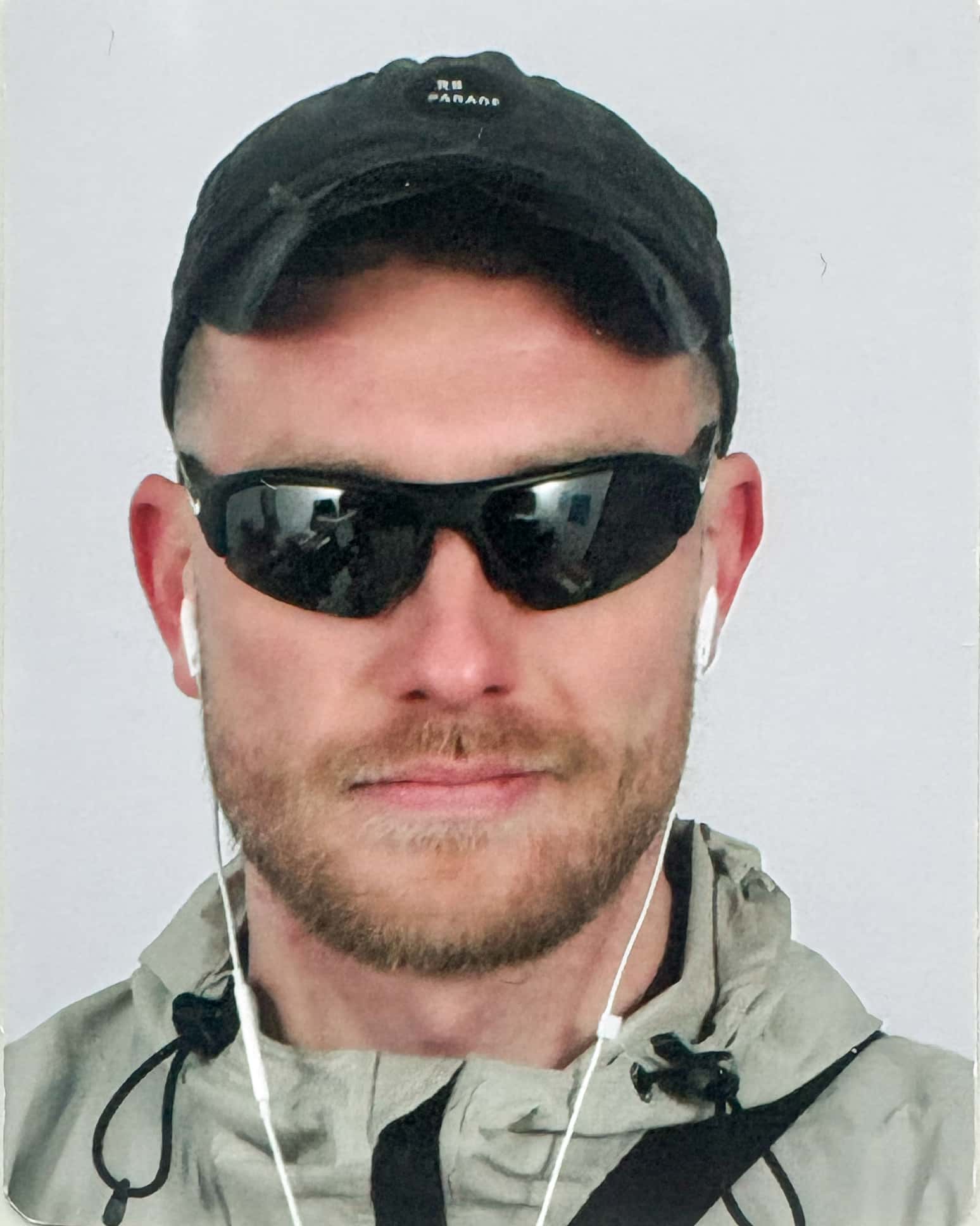
Nol Cobben
Biography
,
1994
I've worked across small studios, in-house teams, and market leaders, and I'm comfortable moving between them. I enjoy collaborating with founders and teams of all sizes, adapting to what each project needs. My work goes beyond how things look. I partner closely to understand what we're trying to achieve, move quickly when it matters, and make thoughtful decisions together. I prefer longer-term partnerships where I can help maintain consistency and keep things moving forward as your needs evolve. If you're interested in working together, or just want to connect, feel free to reach out via Instagram or email.
