We kunnen elkaar zo makkelijk helpen,
maar dan moeten we elkaar wel kunnen vinden.
AskTippi
A logo with character
Instead of going for the expected clean-cut sans serif, we chose a hand-drawn logo with rough edges and real personality. It adds a human touch and reflects Tippi's bold, slightly rebellious spirit. The result feels approachable, expressive, and easy to connect with.
Logo
Built to speak both ways
Tippi needs to move between worlds. It has to catch the eye on social media and convince investors in serious meetings. Poppins, used in every weight, gives the flexibility to shift tone without losing consistency. It helps the brand shout when needed and stay calm when it counts.
Typography
Hello
world
123
abc
?!@#
Hello
world
123
abc
?!@#
Hello
world
123
abc
?!@#
Hello
world
123
abc
?!@#
Regular
Semibold
Bold
Extrabold
Zoek niet verder.
Vraag je netwerk.
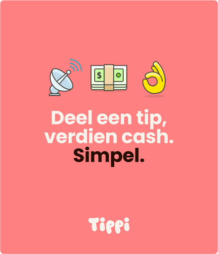
Deel een tip.
Verdien Cash.
Simpel.
Sneller
Door het gemak van Tippi krijg je snel toegang tot de expertise, ervaringen en kennissen van je eigen netwerk en daarbuiten.
A language of their own
Emojis are a core part of how Tippi communicates. Whether it’s one single emoji or a whole cascade of them, they bring emotion, humor, and visual clarity to every message. They create instant recognition and make the brand feel alive. We use them not just as icons, but as a signature graphic element.
Emojis

Designed by Streamline


Rooted in brand, expanded through expression
Tippi uses a signature red and soft cream as its primary colors. These are the foundation for most branded elements.
But expression goes further. Each emoji introduces its own set of colors. The lightest tone in any emoji becomes a starting point for extended backgrounds and layouts.
This system keeps the identity fresh and flexible, while still feeling intentional and consistent.
Color
Soft pink
Warm White
Dark brown
Dark Brown


From punchy Instagram posts to clean investor one-pagers. Tippi's visual system adapts to any context without losing its voice. Always bold, always distinct.


